Shuttle, 2021
Shuttle is an unrealized application that uses the theme of space travel to help people reflect on their screen-time, develop a healthy balance with their hand-held devices, and encourage voluntary disconnection.
Aside from using our phones as functional devices that simplify daily tasks, they frequently occupy our attention throughout the day. Once we get distracted by a notification or mindlessly pick up our phones, we tend to lose track of time in between social media feeds, unread emails, and group chats.
This behavior can sometimes lead to spending more time in front of our screens than we intend to and negatively affect our productivity, sleep, and social interactions. To help people regulate their digital intake and shift their attention to more self-fulfilling activities, I was motivated to create Shuttle.
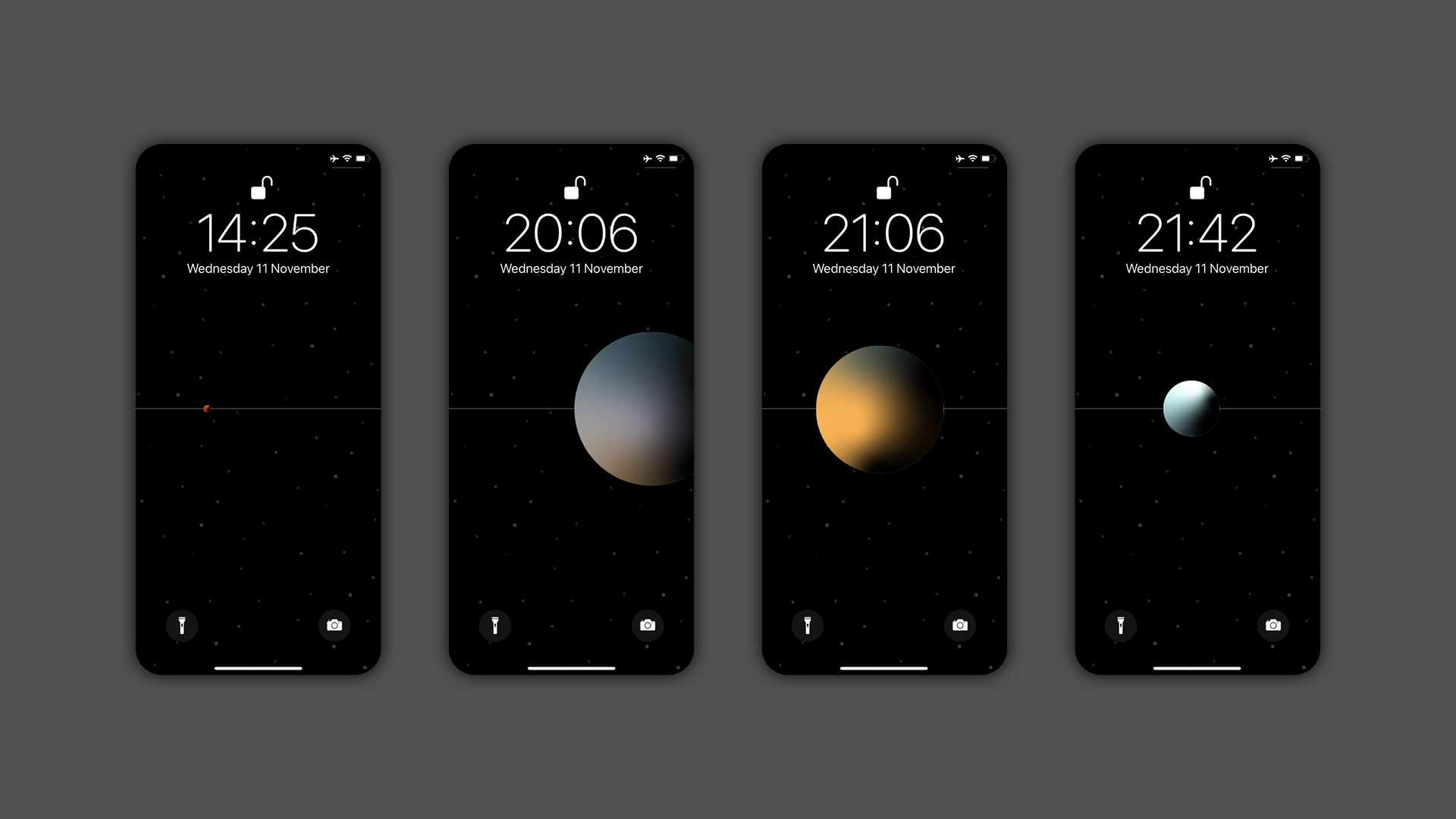
To leverage digital disconnection as a valuable asset, Shuttle keeps track of the time users spend away from their screens and visually communicates it at the first point of re-engagement - the lock-screen. This is meant to encourage people to reflect on their intentions before mindlessly engaging their devices. Users can set goals for the amount of time they wish to spend away from their phones and receive rewards as they work towards them.
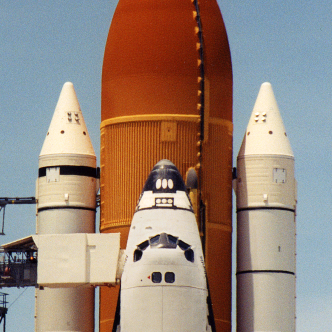
● Visual Reference: Nasa Space Shuttle

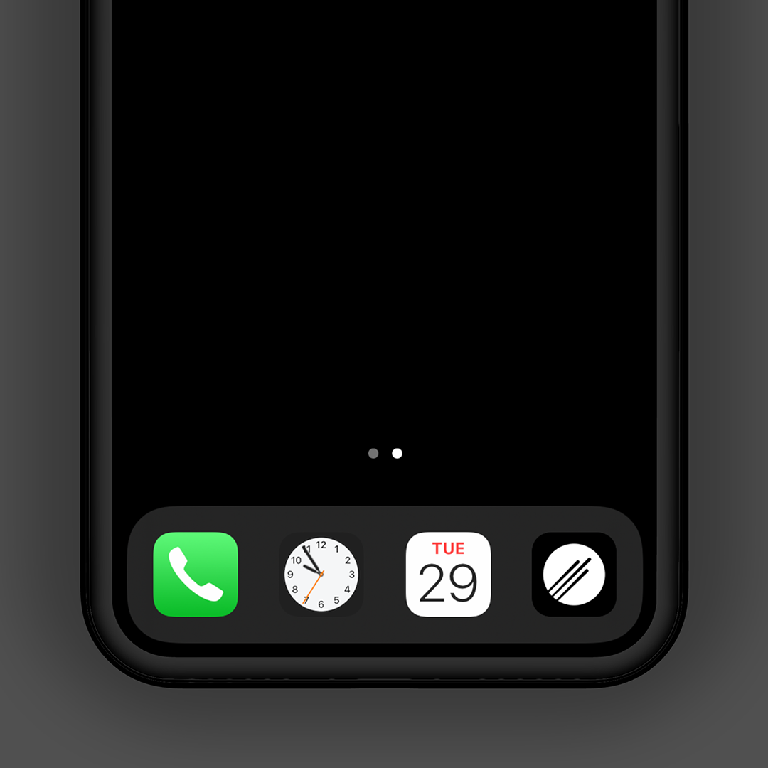
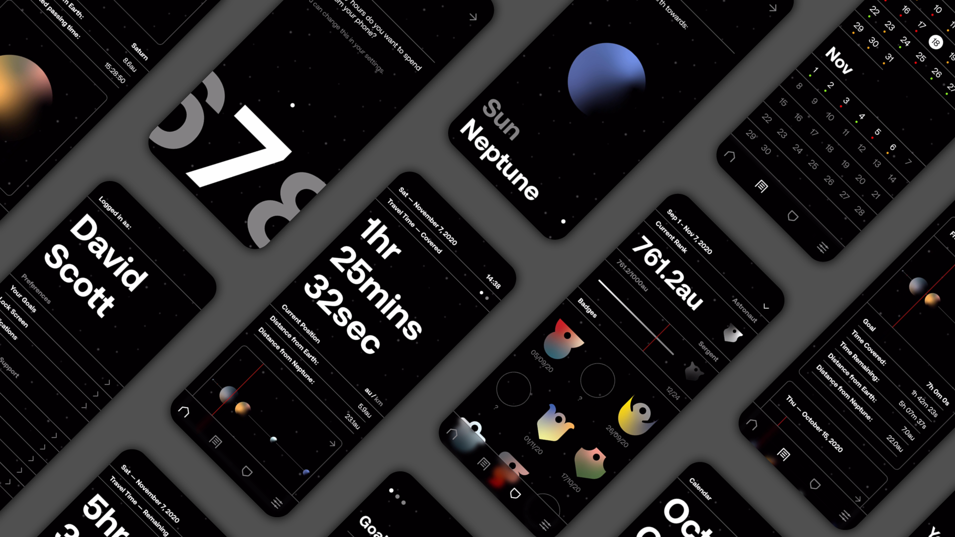
Icons and Planets
A set of custom icons reinforces Shuttle's visual identity across the user interface to aid the user in navigating the app. The gradient-colored planets provide a strong contrast to Shuttle's minimal design and enable the user to remember individual planets.
Onboarding
The onboarding process consists out of three steps to set up Shuttle. After signing up for a new account, users can select a goal, followed by a destination. With Earth as the point of origin, Shuttle provides the option to travel towards the Sun or Neptune, which allows for a variety between journeys as users will pass different planets.
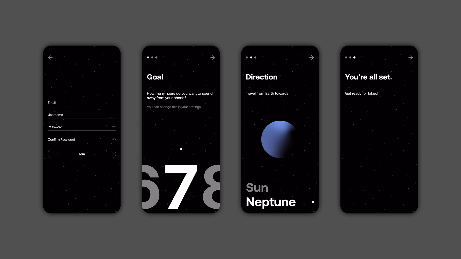
Dashboard
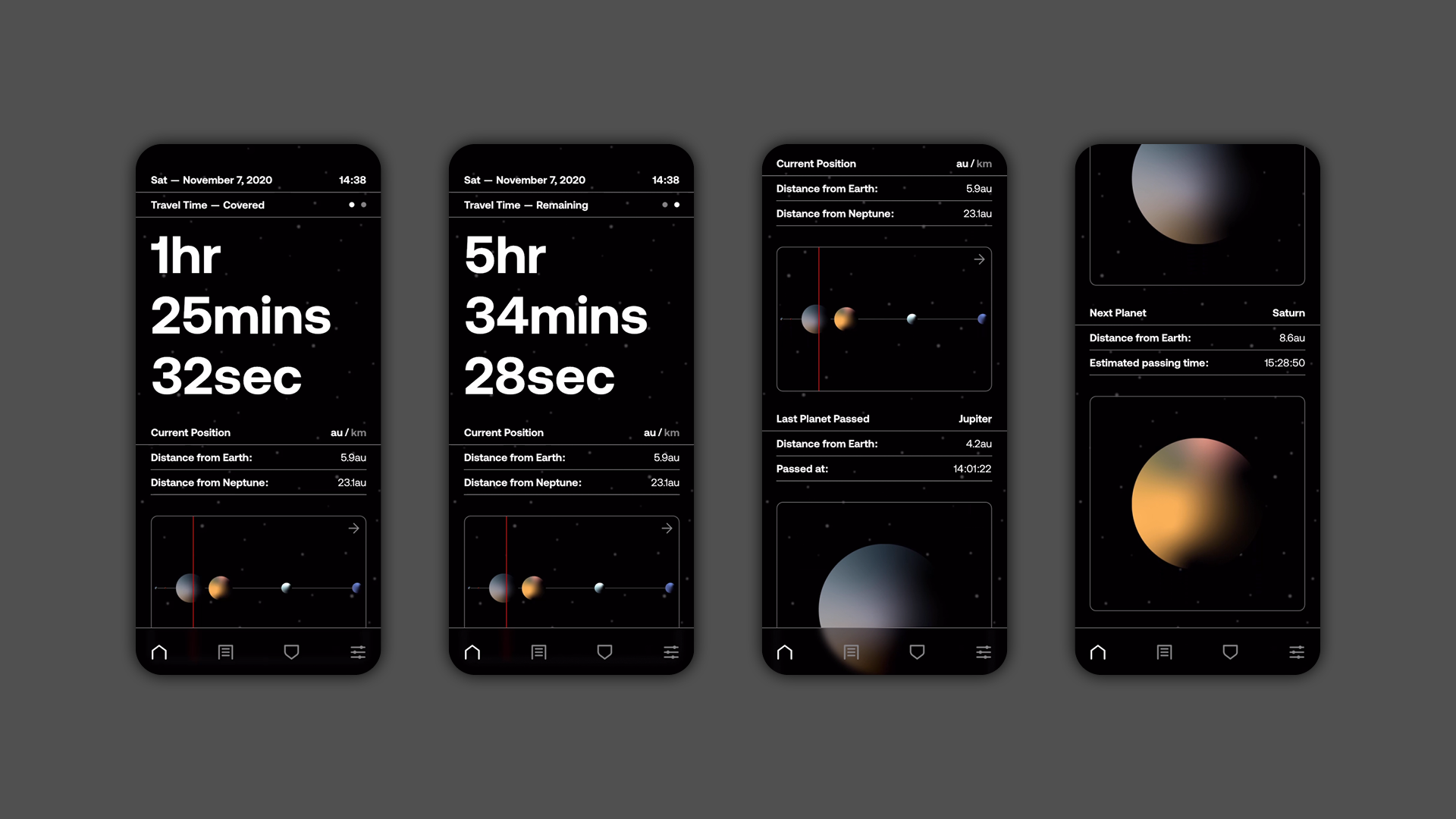
The dashboard displays the user's essential travel data simply and understandably. The interface displays covered travel time, a visual graph that outlines the position along the journey, and the distance from the origin and destination in astronomical units and kilometers. While using this feature instead of checking the progress through the lock-screen, Shuttle pauses the ongoing journey.
Logs
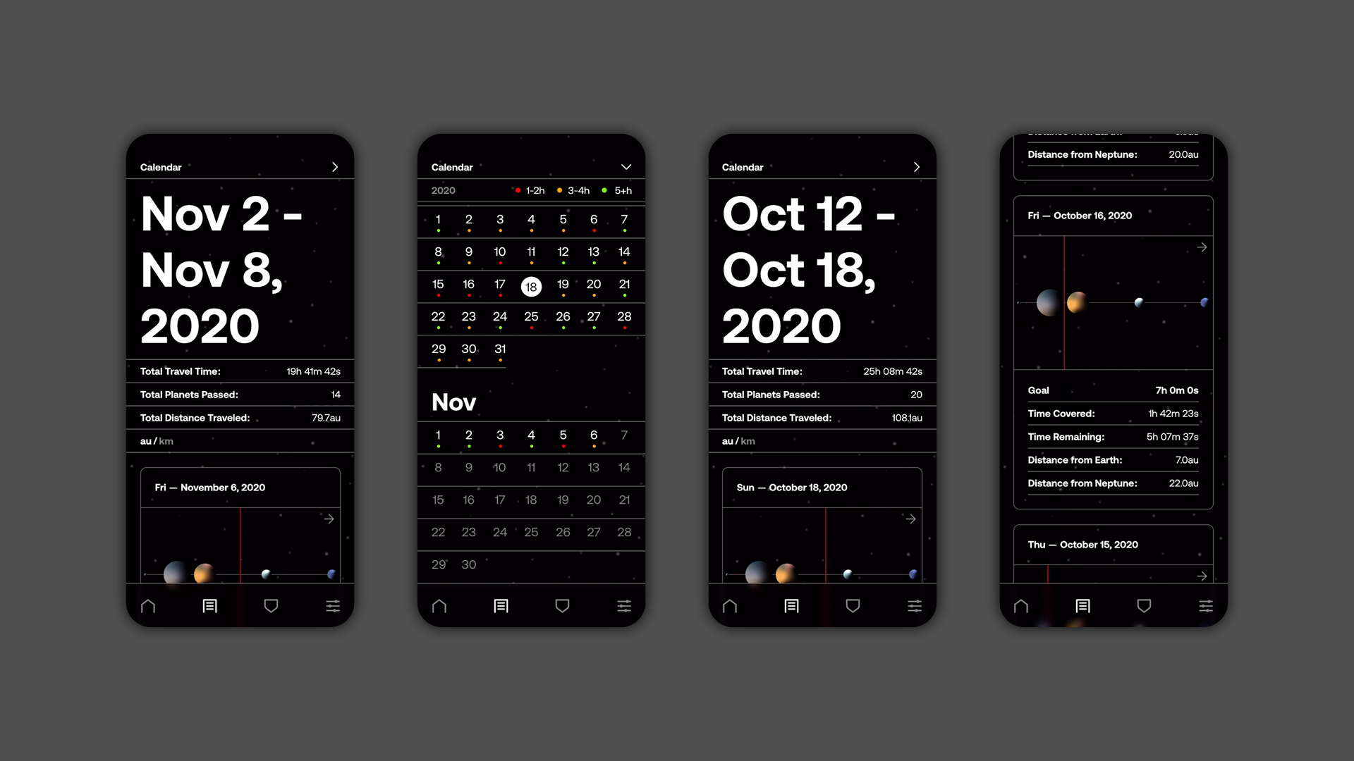
Shuttle keeps track of every journey and stores them as individual logs that the user can view at any time. This part of the app helps users understand their behavior throughout time and compare completed journeys to realise their progress. Each logged journey is part of a week, which the user can access through the calendar. Shuttle sums up a completed week of travel by displaying the total travel time, distance, and passed planets.
Badges
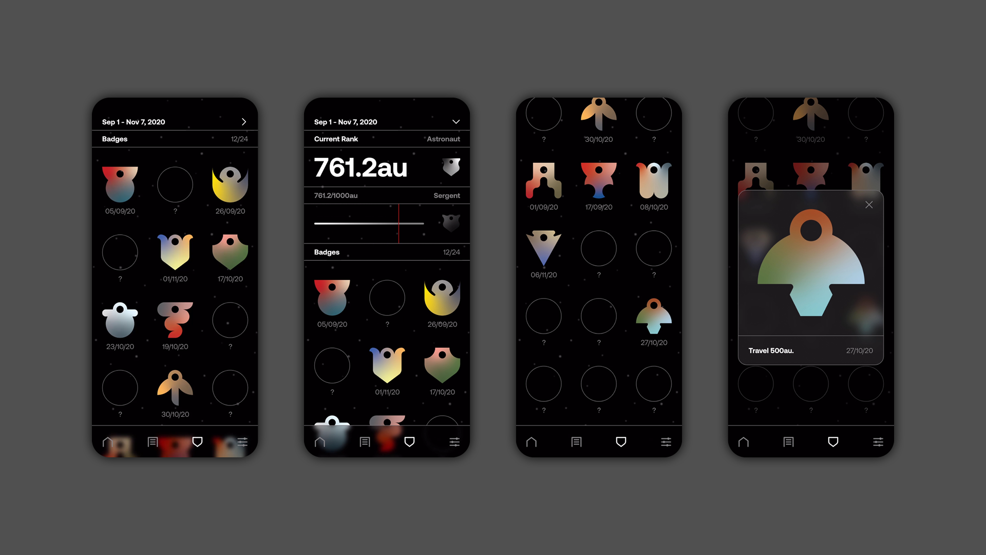
As a reward-system, Shuttle hands out badges for achievements such as traveling for 500au or reaching Neptune for the first time. Additionally, users are assigned ranks according to how many astronomical units they have traveled. The badges, which are inspired by crop circles, follow the same color palette as the planets.
Lock Screen
The lock-screen communicates the user's progress through an accurately scaled representation of the solar system. This part of Shuttle's interface visually informs the user about their progress, without them having to re-engage with their device and interrupting their ongoing journey.